SQL, Python, data visualization, web development, technical writing
Python: pandas and Matplotlib—Coffee survey
Python's pandas and Matplotlib libraries are used to read, manipulate, and visualize data. As an exercise in using these libraries, I created the graphs below based on real-world data found at Kaggle. The data is taken from a 2023 live-streamed event on YouTube that aimed to determine coffee preferences of Americans via real-time tastings and surveys.
The complete Jupyter Notebook in which I worked can be viewed at my GitHub repository. Specific code examples, process notes, and the graphs themselves, can be viewed below.
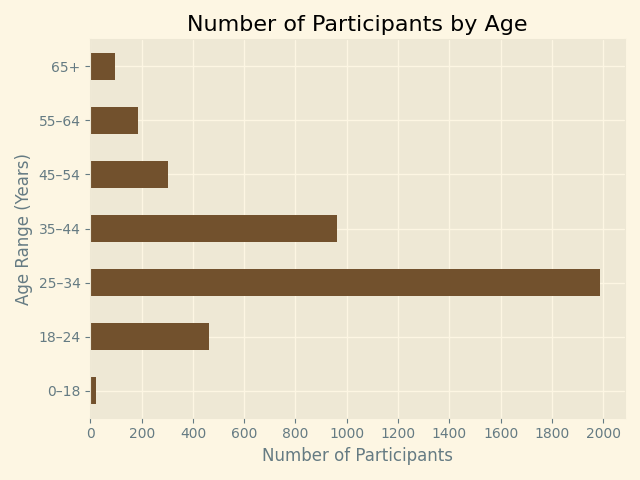
Age of participants
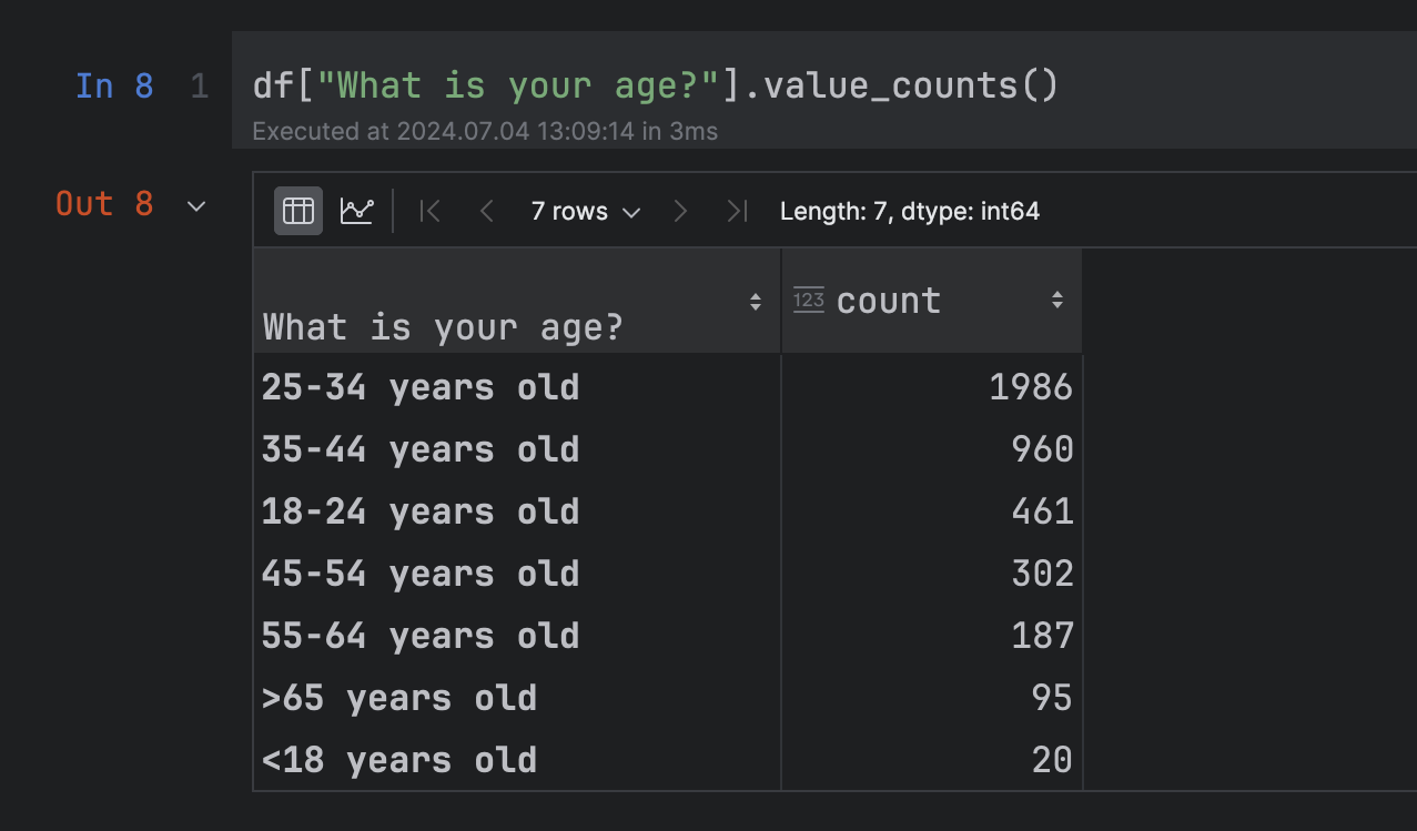
I first wanted to see the age distribution of everyone who had participated in the survey. Utilizing the "What is your age?" column, I created the following pandas DataFrame, as seen in my Notebook:
Using the DataFrame, I then created a bar graph of the data using Matplotlib:
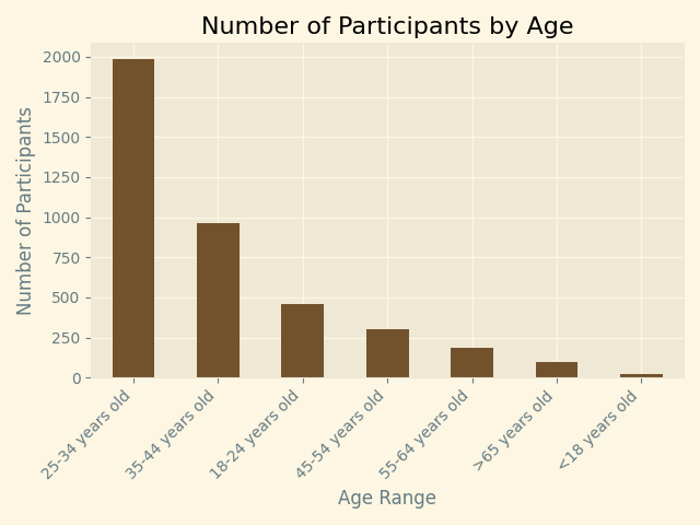
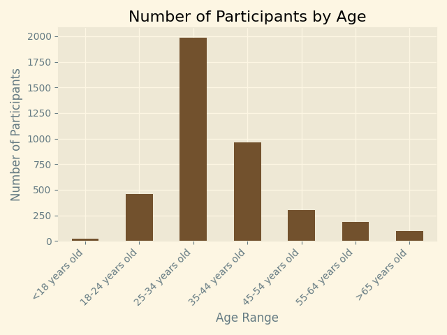
The value_counts() function defaults to returning the data in descending order based on count. It was more intuitive to visualize the data in the order of younger ages to older ages, so I rewrote the DataFrame to grab data in the order that I wanted, which produced this graph:
Finally, I felt that a horizontal bar graph would be easier to read. I also simplified the age tick labels, rather than use the labels that are returned from the original survey. The final code I used can be seen below the graph:
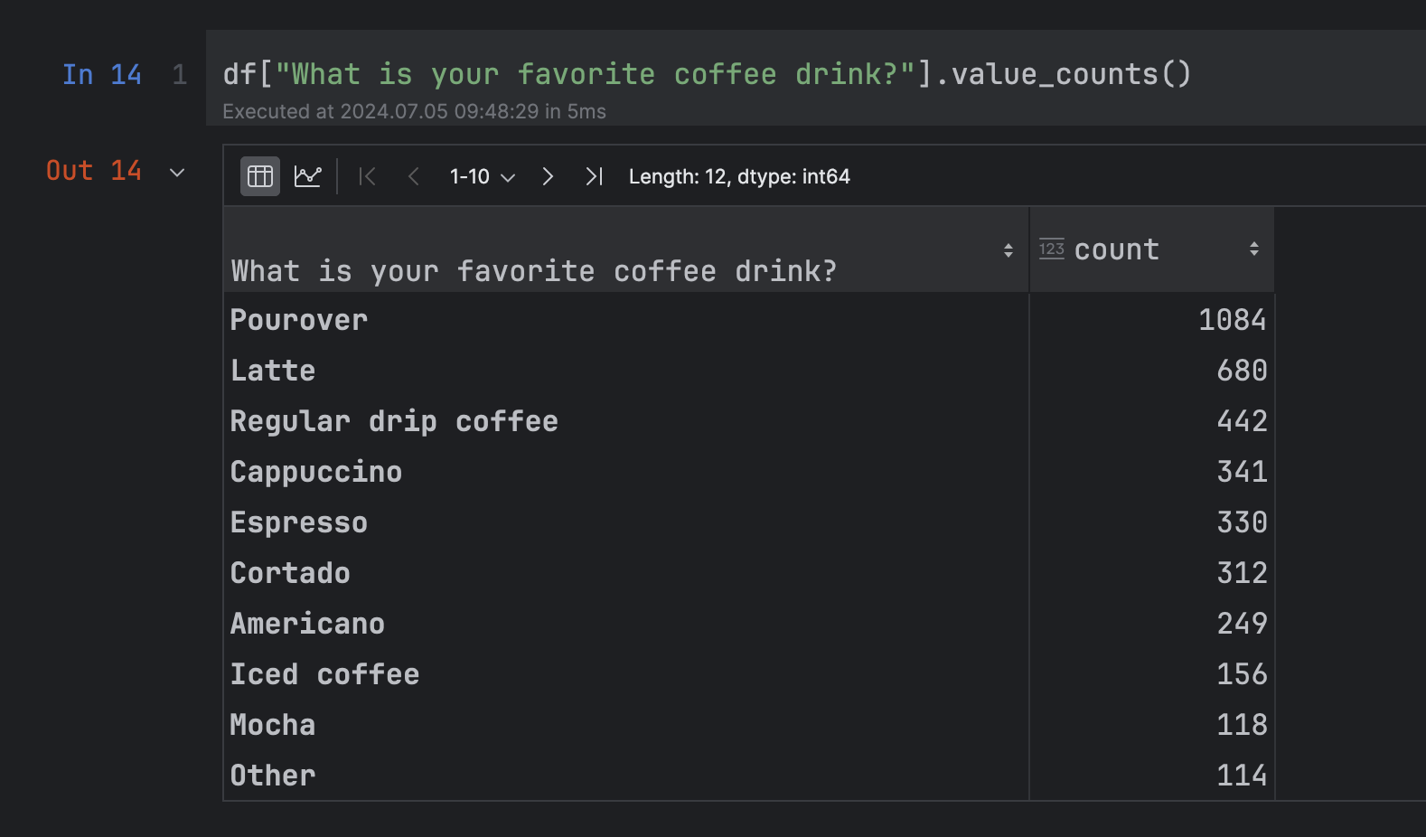
Favorite coffee drink
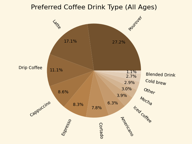
My next graph was to be based on the favorite coffee drink of all participants:
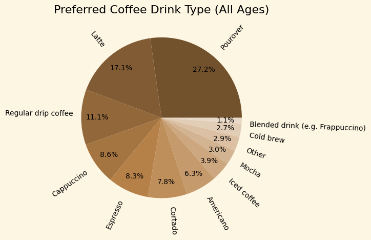
I again created new labels, altering "Regular drip coffee" and "Blended drink (e.g. Frappuccino)". This required making a new list using the survey question indexes that were used in the DataFrame:
I then wanted to see if drink preference changed based on age. To do this, I used the pandas groupby() function to create groups of participants based on the age ranges used in the survey. I was then able to isolate the preferences of each age range.
I first graphed the "25-34 years old" group, then compared it to the "55-64 years old" group.
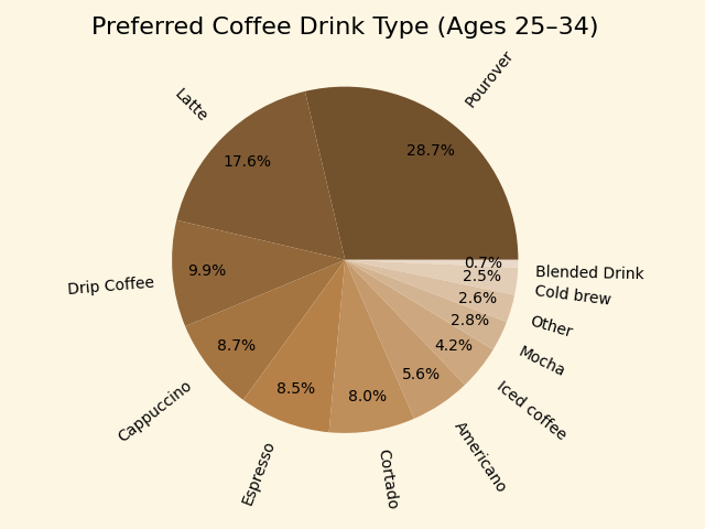
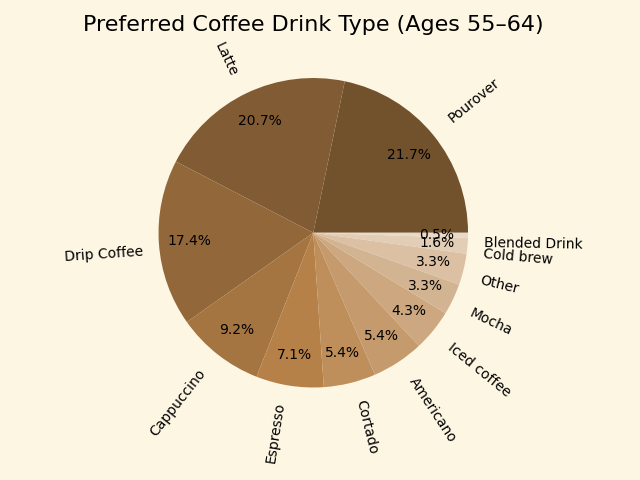
The ordering of drink preference is identical for each of these age groups—it is, indeed, the same ordering found in the initial pie chart measuring drink preferences of all ages combined. The biggest difference between the two age groups charted is a not-insignificant increase in "Drip Coffee" preference for the older group. This can be compared to an increase in "Pourover" preference in the younger group.
Below is the code used to chart the "55-64 years old" age group. It is similar to the code used in all three pie charts:
Two final data examinations
I was interested in knowing two final things that could be found in the data: how many cups of coffee participants drink per day, and how much they spend on coffee per month. I created the following pie charts, once again showing charts for "All Ages", "Ages 25–34", and "Ages 55–64":
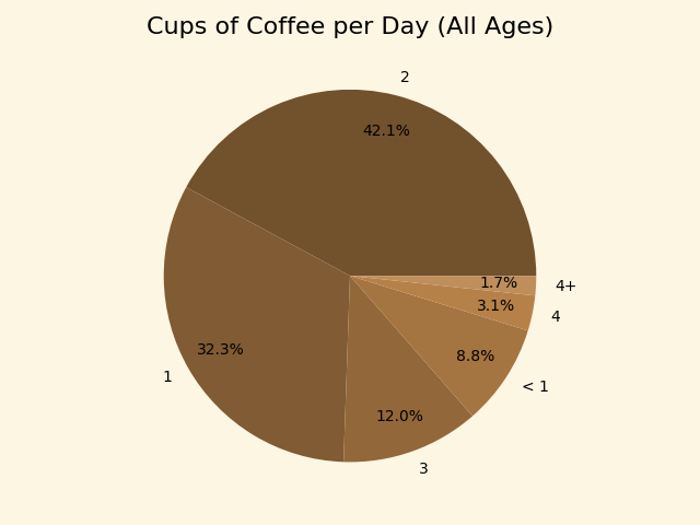

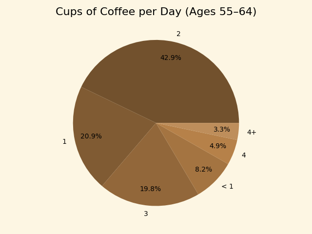
It was interesting to see that a higher percentage of the older age group drank three cups of coffee per day compared to both the younger age group and the entire group of participants. This is also true with four cups per day.
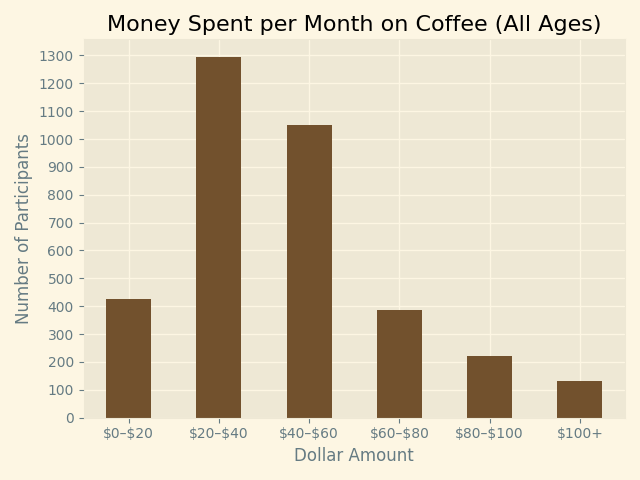
My final graph shows the dollar amount spent per month by all participants. The code used to make the graph then follows: